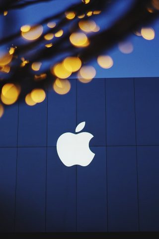
A Pocket History of Rob Janoff and the Iconic Apple Logo

Business management trends to watch in 2017
March 23, 2017
What is the best paper to print flyers? [Infographic]
April 6, 2017
Rob Janoff is perhaps best known for creating the iconic Apple logo in 1977, but he has also worked with many other big names in the computing industry and beyond.
#The Man:
Janoff’s story starts in Culver City, California, where he was born and grew up. He attended nearby San Jose State University where he studied not graphic design but industrial design. He worked in that field until 1977, when he switched to the work that would make him famous (even if only in certain circles).
In 1977, Janoff began work at Regis McKenna, then only 7 years into its own soon-to-be epic history. Apple was one of Janoff’s first projects at Regis McKenna, but if course no one knew what industry titans young Steve Jobs and Steve Wozniak would eventually become.
To be sure, the elegance of the logo Janoff produced, and the powerful brand it spawned, was partially responsible for that success.
Janoff did not stay with McKenna forever, but moved on to work with some of the largest agencies in New York and Chicago, where he would work with national and international companies of all kinds on their branding as well as their print and television advertising projects.
Today, Rob Janoff lives in Chicago, where he does little actual graphic design work. Instead he keeps his hands in, both as a consultant and as an educator, encouraging the next generation of great graphic designers.
#The Logo:
The story has it that in 1977 Jobs and Wozniak offered Regis McKenna a 20% stake in their company in exchange for design services. McKenna opted instead for a flat fee, which seemed quite reasonable at the time. He passed the project on to the recently hired Janoff, who served as Creative Director for the corporate identity package they produced. Janoff had a history with the tech industry already, and he seemed a natural choice for the job.
#The Turing connection
There are many stories about the bite missing from the apple, and how it became part of the iconic design. One story (conveniently ‘discovered’ just after the film Enigma came out in 2001) linked the missing bite to Alan Turing, who is supposed to have died when he ate a poisoned apple, humiliated and criminalized for his lifestyle and unrecognized for his achievements.
That, like so many other really engaging stories is a myth, though. The truth appears to be that there was some initial concern that the logo could be easily identified as an apple, and not some other kind of fruit or berry. The decision to have a bite taken out of it was just to emphasize that it was not, in fact, a cherry.


